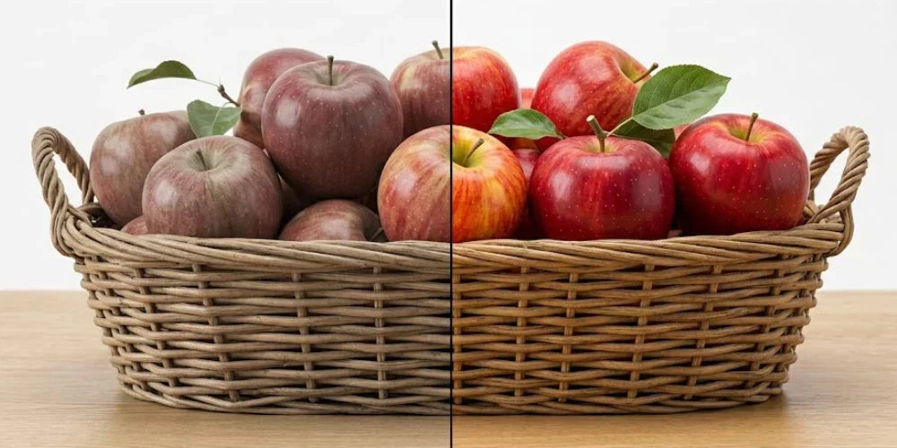
Have you ever specified a "90 CRI" fixture for a kitchen or bathroom only to find that skin tones look sickly and red accents appear muddy or brown? You are likely experiencing a lack of R9.
In the lighting industry, the standard Color Rendering Index (CRI) is often a "baseline" metric that hides a light’s true performance. To achieve professional results, you must look past the average and understand how R9 completes the picture.
General vs. Special CRI: Why the Score is Deceiving
To understand why a high-scoring light can still look "grey," you have to look at the two tiers of the CRI system:
- General CRI (Ra): This is the number you see on the box (e.g., 80 CRI, 90 CRI). It is an average of only eight pastel color samples, labeled R1 through R8. Because these colors are muted, they are relatively easy for standard LEDs to reproduce.
- Special CRI: This category covers samples R9 through R15. These are the "hard" colors—vibrant reds, deep blues, and natural skin tones.

The problem? Special CRI samples are not included in the standard Ra score. A manufacturer can optimize a light to hit the eight pastel R1–R8 targets perfectly—earning that "90 CRI" label—while failing completely on the Special CRI samples. If you only look at the Ra score, you are missing the most vibrant half of the spectrum.
Defining R9: The Saturated Red Factor
Of all the Special CRI samples, R9 (Saturated Red) is the most critical. It is the "missing link" in modern lighting because red is the hardest color for LEDs to produce accurately.
Most white LEDs are naturally strong in blues and yellows but weak in the long-wavelength red spectrum. Without specific, high-quality red phosphors, a light will have a high "General" CRI but a very low or even negative R9 value.
- General CRI (Ra): Tells you if the light is "generally okay" with muted, pastel colors.
- R9: Tells you if the light can handle the warmth, vibrancy, and richness of the real world.

R9 Performance Tiers: What to Look For
For a professional-grade color experience, you should aim for an R9 value of 50 or higher. This is the benchmark for ensuring wood, food, and people look their best.
| Level | R9 Value | Best Real-World Application |
| Basic | 0 to 20 | Standard offices, warehouses, and parking garages. |
| Good | 20 to 50 | General residential areas (hallways, laundry rooms). |
| Great (Pro) | 50 to 80 | California Title 24 (JA8) compliance. High-end kitchens, retail, and vanities. |
| Exceptional | 80 to 95+ | Art galleries, professional photography, and surgery suites. |
Why R9 50+ is the Benchmark
- Human Skin Tones: Healthy skin relies on red undertones (R13 and R15). When R9 is low, people look pale, "ashy," or grey. This makes high R9 mandatory for bathroom vanities and dressing rooms.
- Natural Materials: Red is the "warmth" found in cherry cabinets, mahogany furniture, and leather. Without it, these materials look flat or muddy.
- Food Accuracy: Red wavelengths make meat look fresh and produce look appetizing. This is why high R9 is a standard requirement for grocery and dining applications.
TM-30: The High-Definition Standard
If CRI and R9 give you a snapshot of color, IES TM-30-24 provides the full "high-definition" movie. Developed to replace the aging CRI system, TM-30 uses 99 real-world color samples instead of just 8 pastels.
(Note: For a complete breakdown of how to use these metrics in commercial applications, read our full Specifier's Guide to TM-30 vs. CRI.)

Key TM-30 Metrics
- Fidelity (Rf): The direct successor to CRI. It measures overall accuracy on a scale of 0–100. (If you are looking for the TM-30 equivalent of R9, look for Rf,h1, which measures the fidelity of the red hue bin).
- Gamut (Rg): Measures Saturation (vividness). Values over 100 mean colors "pop."
- Color Vector Graphic: A visual circle showing exactly which direction colors are shifting. If the line bulges toward red, the light is intentionally enhancing reds.
CRI vs. TM-30-24 Comparison
| Feature | CRI (Ra + R9) | TM-30-24 (The New Standard) |
| Color Samples | 8 (Pastels) + 1 (Red) | 99 (Real-world objects) |
| Accuracy Metric | Ra (0-100) | Rf (0-100) |
| Vibrancy Metric | None | Rg (60–140) |
| Visual Aid | None (Numbers only) | Color Vector Graphic |
| Predictability | Low (Susceptible to "gaps") | High (Comprehensive spectrum) |
How to Specify Like a Pro
For projects where color matters, do not rely on CRI alone. Check the manufacturer's spec sheet for:
- CRI (Ra): 90+
- R9: 50+
- TM-30 Rf: 85+
- TM-30 Rg: 100–105
Targeting these benchmarks ensures your LED strip lights and recessed lighting produce the rich, natural "glow" that defines a professional installation.


