If you are an architect, lighting designer, or commercial specifier, you have likely encountered this problem: you specify a fixture at "90 CRI," but the installed lighting makes the space look slightly green, or the finishes look dull and lifeless.
The Color Rendering Index (CRI) is an 80-year-old metric that is no longer sufficient for modern LED technology. For high-end design, retail, and commercial spaces, the industry has shifted to a much more precise standard: ANSI/IES TM-30-24.
Here is why TM-30 is the new gold standard for color quality, and how you can use it to write bulletproof lighting specifications.
The Problem with CRI: The 8-Sample Limitation
Both CRI and TM-30 measure how accurately a light source renders color compared to a reference light (like natural sunlight). However, the accuracy of that measurement depends entirely on the sample size.
- CRI (Ra) uses 8 pastel colors. Because the standard CRI calculation only averages eight muted, pastel colors, LED manufacturers can engineer their phosphors to hit those specific targets perfectly. This allows a fixture to achieve a high CRI score on paper while completely failing to render saturated reds (for a deep dive on this, read our Guide to the R9 Factor), deep blues, or complex skin tones.
- TM-30 uses 99 real-world colors. TM-30 evaluates a light source against 99 Color Evaluation Samples (CES) sourced from real objects like skin, textiles, plastics, and nature. It is nearly impossible to "game" a 99-sample spectrum, making TM-30 a highly reliable metric for modern LEDs.

The "Big Three" of TM-30
Unlike CRI, which provides a single, easily manipulated number, TM-30 provides a multi-dimensional look at how light affects color. To read a TM-30 report, you need to understand three core components:
A. Fidelity Index (Rf): The Accuracy Metric
Fidelity measures how closely the light renders colors compared to the reference source on a scale of 0 to 100.
- It is the direct, highly accurate successor to the CRI (Ra) score.
- If a light has an Rf of 95, you can trust its color accuracy across the entire visible spectrum, not just pastels.
B. Gamut Index (Rg): The Vividness Metric
CRI cannot tell you if a light makes colors look saturated or dull. TM-30 solves this with the Gamut Index, which measures the average increase or decrease in saturation.
- Rg < 100: Colors appear desaturated, muted, or "washed out."
- Rg = 100: Saturation matches the reference light perfectly (neutral).
- Rg > 100: Colors appear more vivid, saturated, and "popping."
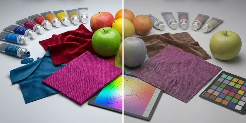
C. The Color Vector Graphic: The Visual Map
This is the most practical tool for specifiers. The Color Vector Graphic is a circular chart divided into 16 "Hue Bins" that shows you exactly how specific colors are shifting under the light.

- Outward Arrows: The light is over-saturating that specific color.
- Inward Arrows: The light is dulling that specific color.
- Shifting Left/Right: Indicates a hue shift (e.g., a "true red" shifting to look slightly orange or pink).
Real-World Applications: Specifying Rf and Rg
To select the right TM-30 values, you must look at the specific visual goals of the space. You don't always want a perfectly neutral light; sometimes, you want materials to pop.
Here is the procurement-ready guide for specifying TM-30 by application:
| Application | Fidelity (Rf) | Gamut (Rg) | The Visual Goal |
| High-End Retail & Showrooms | 90+ | 100–105 | Makes merchandise and fabrics "pop" and look vividly saturated. |
| Museums & Galleries | 95+ | 98–102 | Extreme accuracy to preserve the artist's exact intended colors. |
| Healthcare & Clinics | 90+ | 100 | Perfectly neutral rendering for accurate diagnosis of skin tones and tissue. |
| Restaurants & Hospitality | 85+ | 102–110 | Enhances the warmth of wood finishes and gives food an appetizing look. |
| Standard Office & Industrial | 80+ | 90–100 | Efficiency and visual comfort prioritize over perfect color rendering. |
| Outdoor & Security | 70+ | N/A | Visibility and efficiency are more important than color nuances. |
Understanding the Values in Practice
-
The "Vivid" Sweet Spot (Rg > 100)
To make retail displays, jewelry, or hospitality finishes truly stand out, aim for an Rg between 102 and 105. This slight bump in saturation gives materials a vibrant, lifelike quality that a standard 90 CRI fixture cannot match. Just be careful not to push the Rg past 110, as colors will begin to appear cartoonish or overly "neon." -
The "Natural" Baseline (Rf 90+ / Rg 100)
In healthcare facilities or luxury residential kitchens, a neutral gamut is best. You want an Rg as close to 100 as possible, paired with an Rf of 90 or higher. This combination guarantees that food looks fresh and human skin tones appear healthy and natural. -
Decoding the Vector Graphic
Always review the circular vector graphic before approving a spec sheet. Even with a high overall Rf score, the graphic might show an inward "pinch" in the red zone, indicating that reds will render poorly in reality.
Writing Specs for 2026: The New Benchmark
For years, "90 CRI" was the copy-and-paste standard for high-end procurement. Moving forward, relying on CRI leaves your projects vulnerable to unpredictable tint shifts.
The "Natural" Sweet Spot: For spaces like high-end residential kitchens, corporate lobbies, or modern workspaces, the new industry benchmark is Rf 85 / Rg 100.
Procurement-Ready Language: Instead of asking for "High CRI," upgrade your spec sheets with the following language:
"Fixtures must meet ANSI/IES TM-30-24 standards with an Rf value ≥ 85 and an Rg value between 98–105."
By adopting TM-30, you eliminate the guesswork and ensure that the commercial lighting and architectural fixtures you specify will render the environment exactly as you designed it.


